Cathédrale de Metz
national public commission
signage
type design
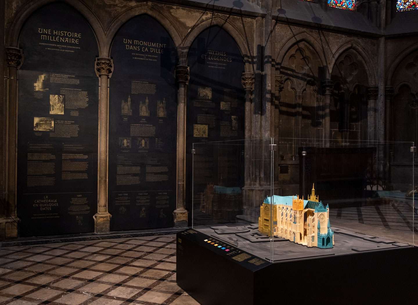
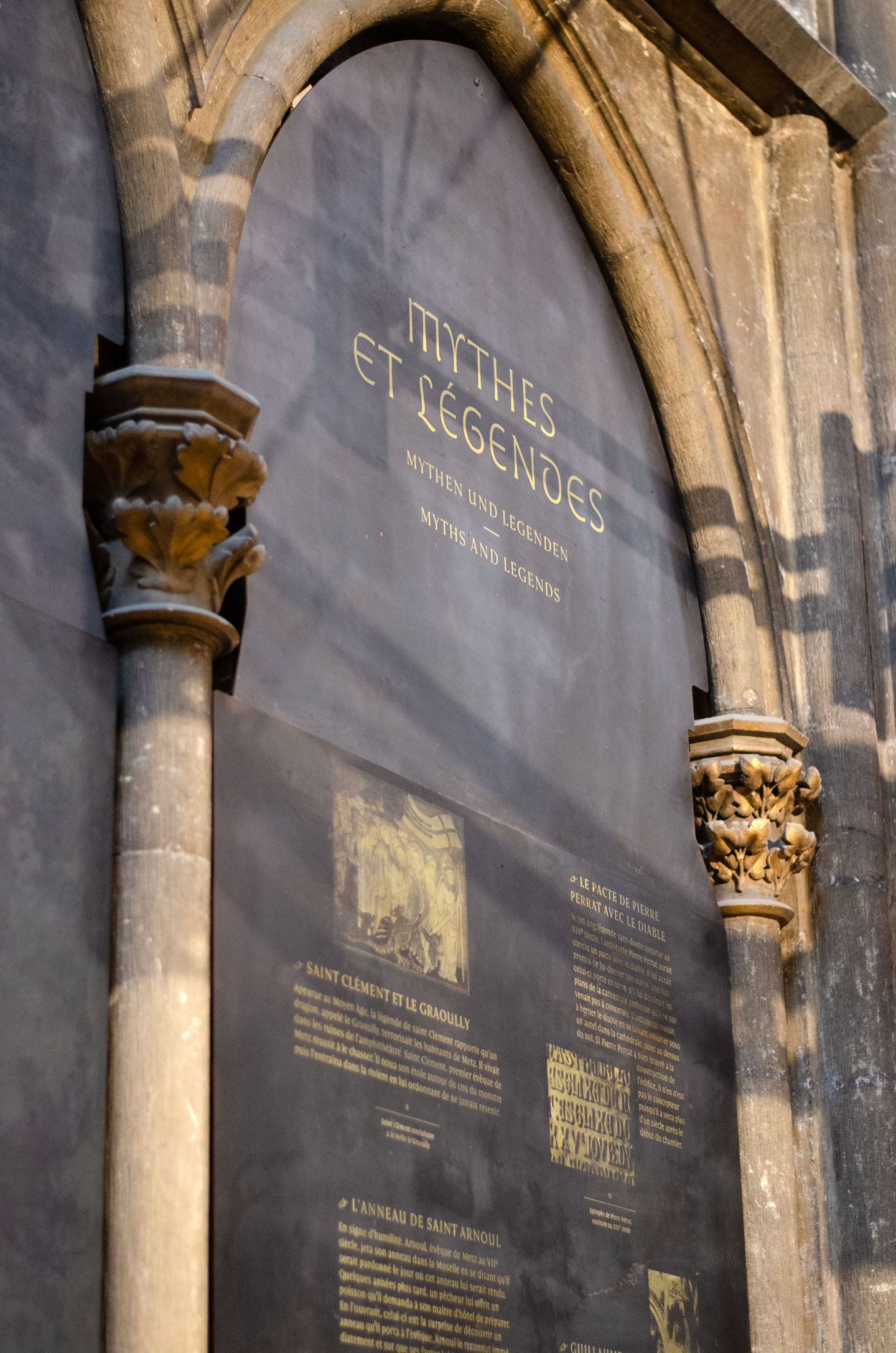
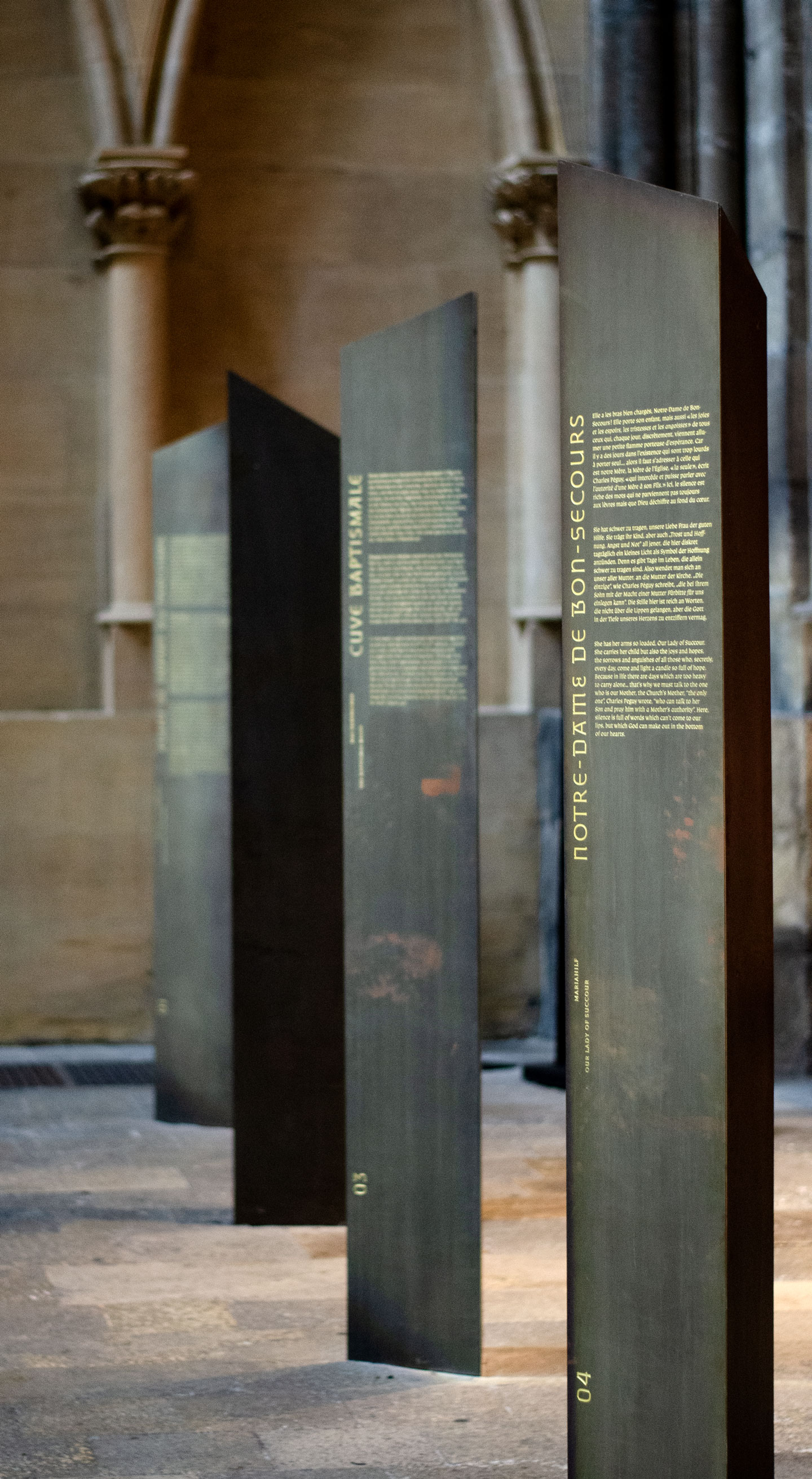
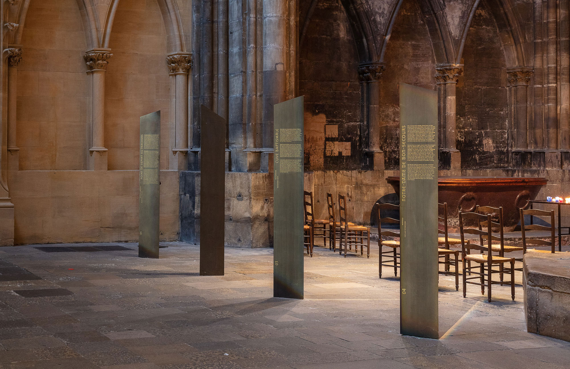
Within the framework of a public commission from the French Ministry of Culture and Communication, for which we were laureates as part of the design collective Nouvelle étiquette, we designed a full signage and typographic system for the cathedral of Metz: a spiritual tour engraved in metal, texts projected on the walls and vaults, a heritage area in the very heart of the stone.
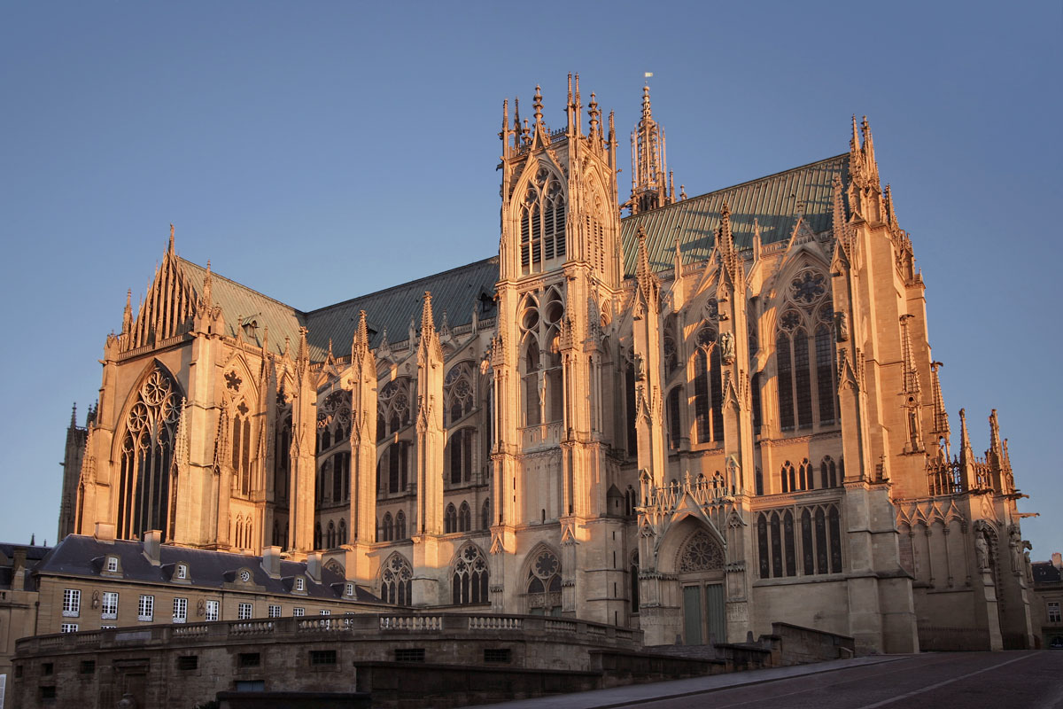
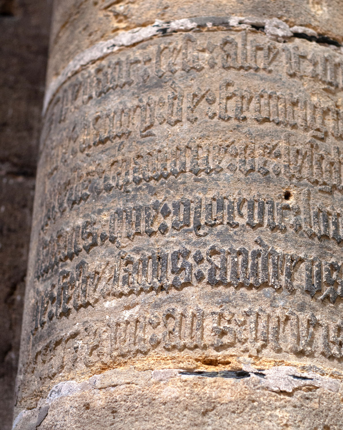
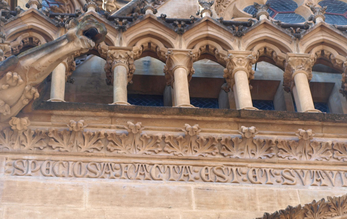
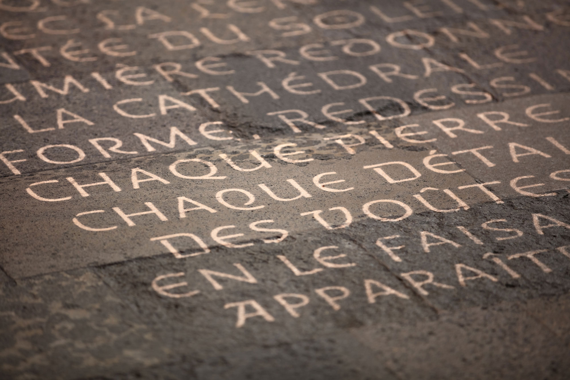

As a result, a family of bespoke typefaces has been developed. Its first member, "Cathédrale Lumière" is thought as a sensitive interpretation of the richness of the lapidary carvings of the building.

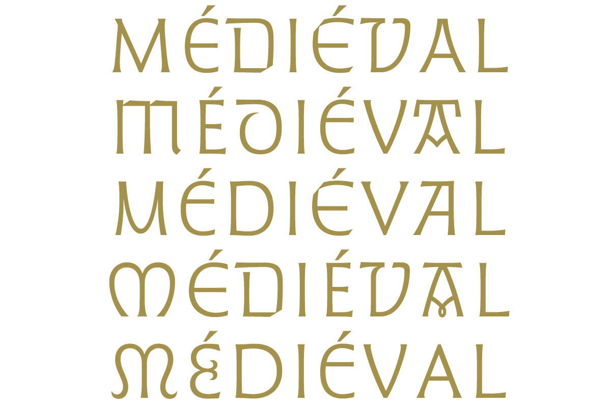
Typeset by light and not by ink, this sans serif immediately appears contemporary in spite of its direct gothic forms. Its variations allow, over the course of the type compositions, the same word to be expressed with very different tones.
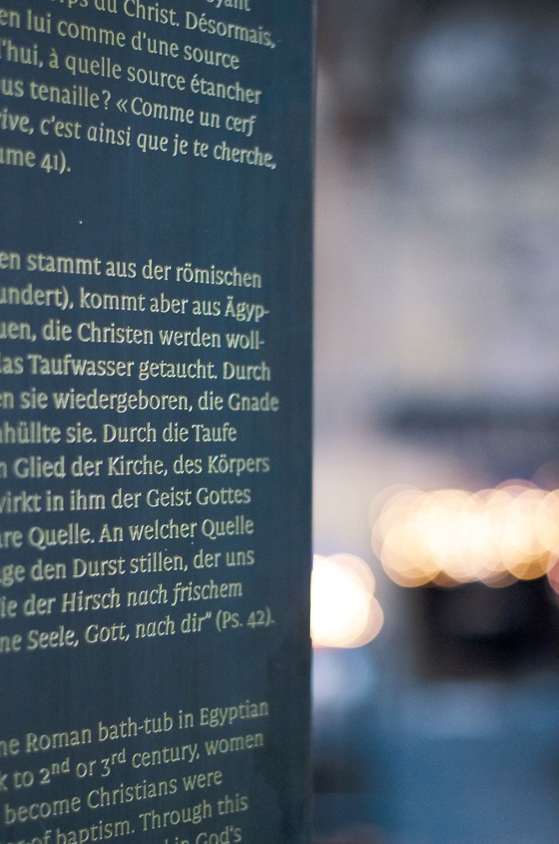
Designed for a more immersive experience, a text typeface accompanies the titling version: "Cathédrale Métal".
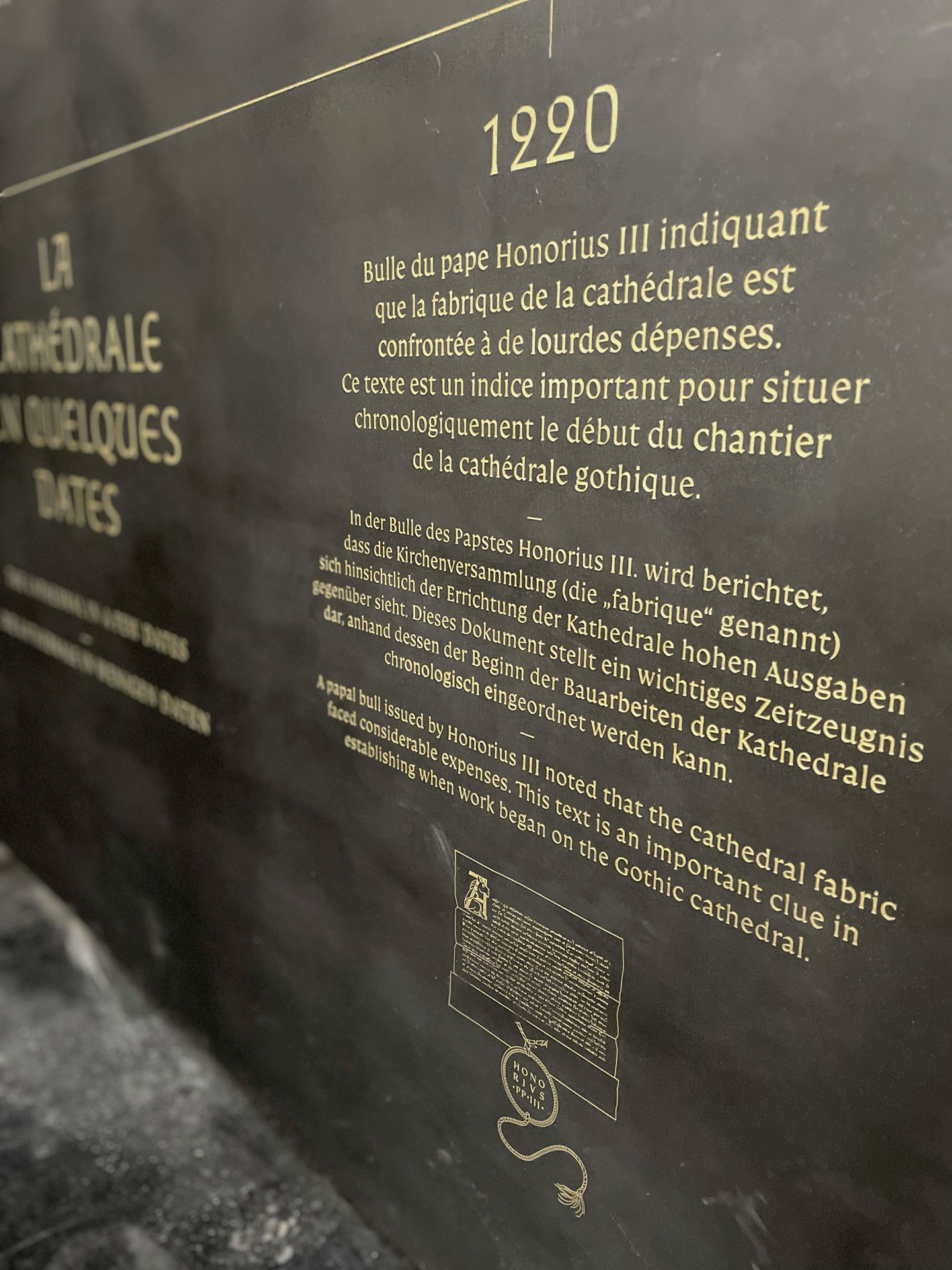
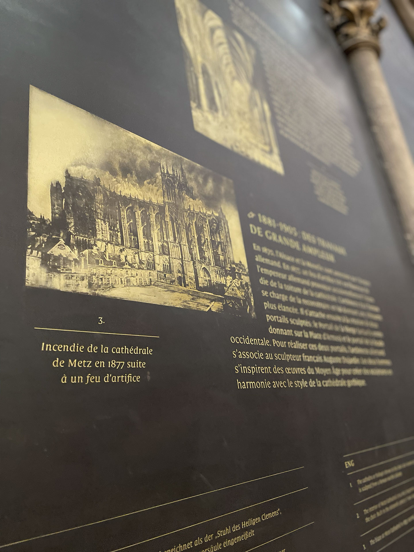
Its letters, slightly condensed and blacker than usual, are designed to be etched in steel.
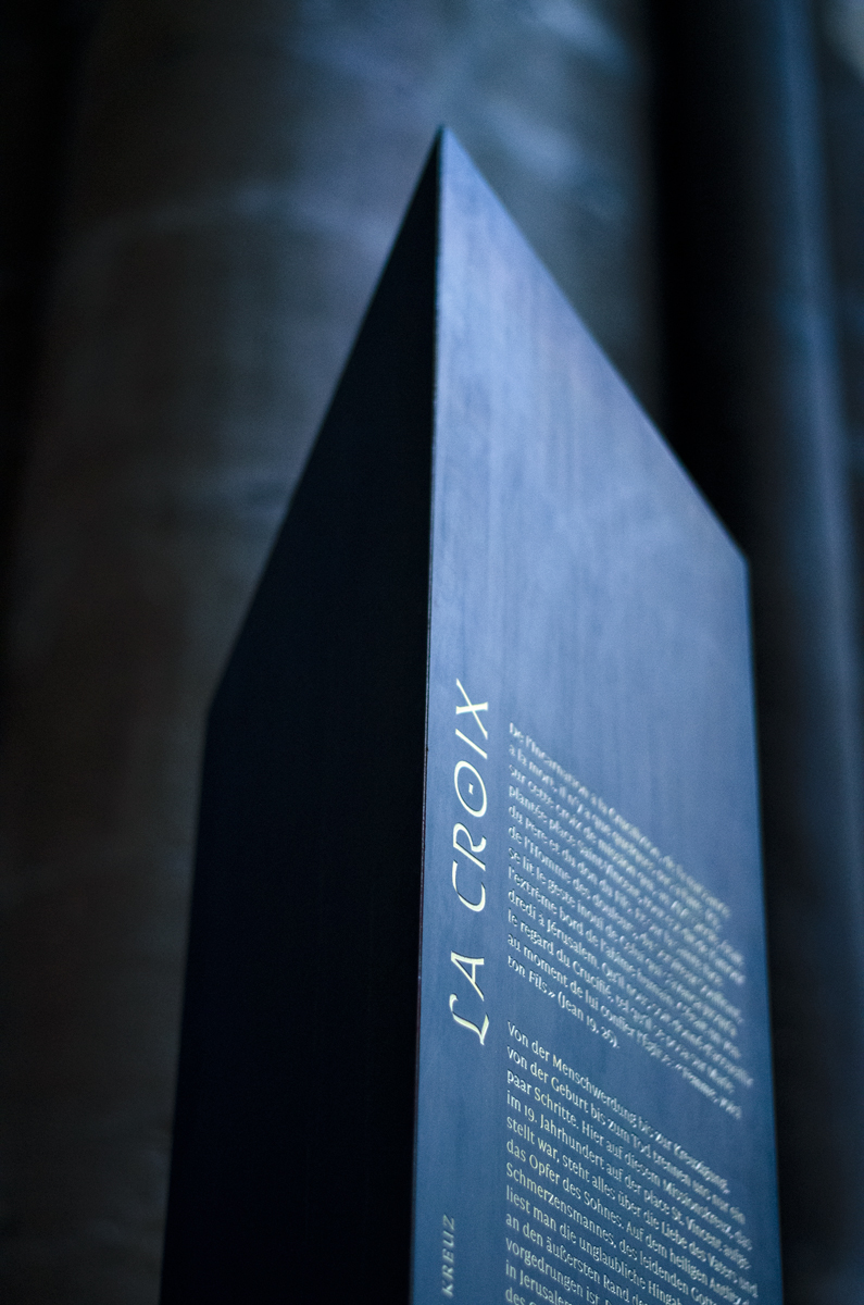
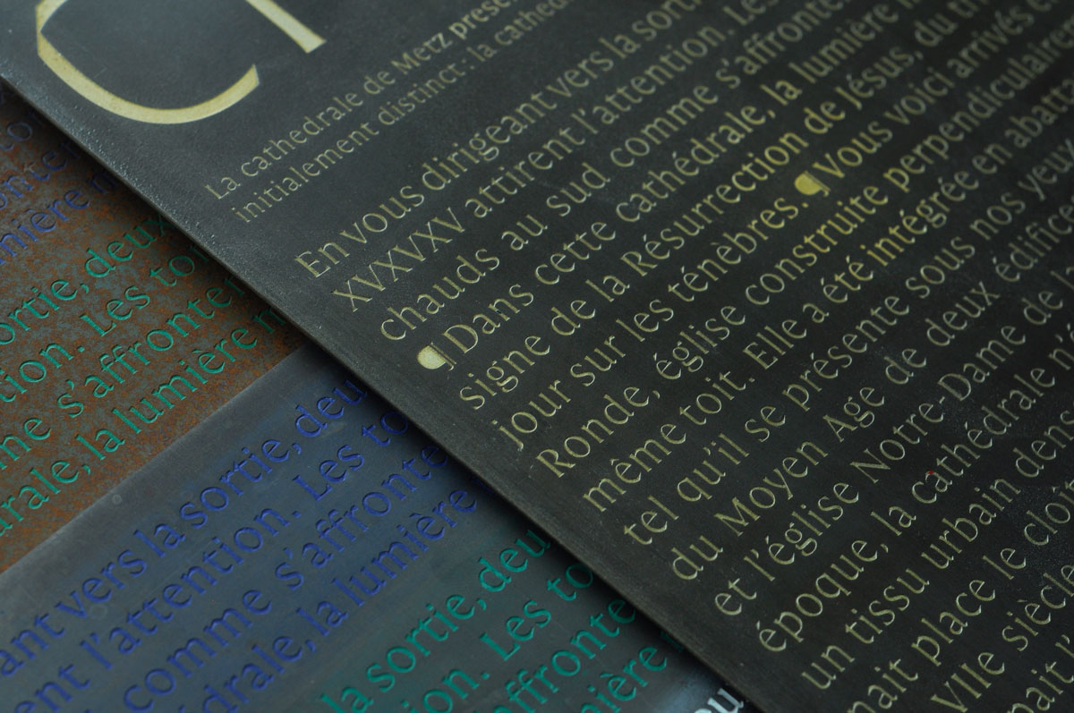
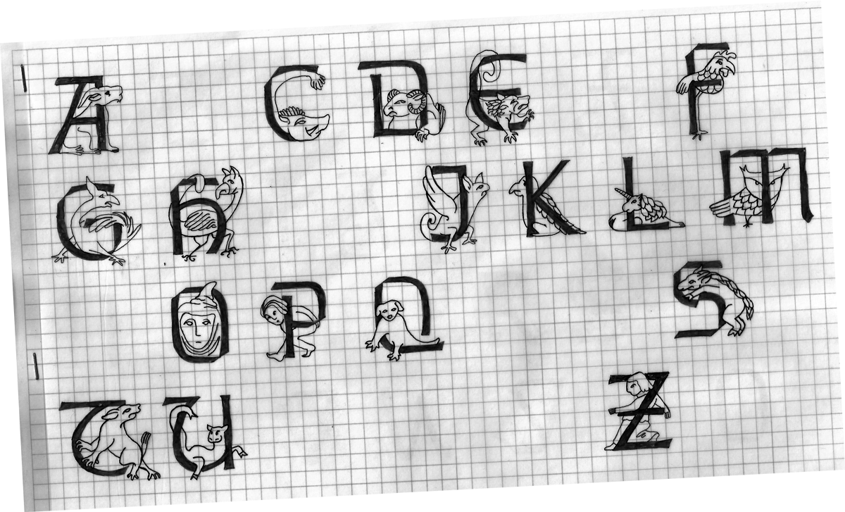

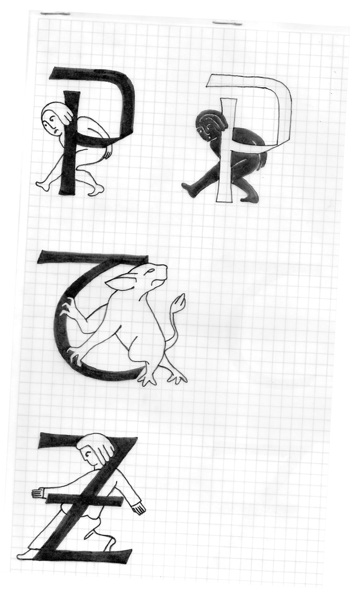
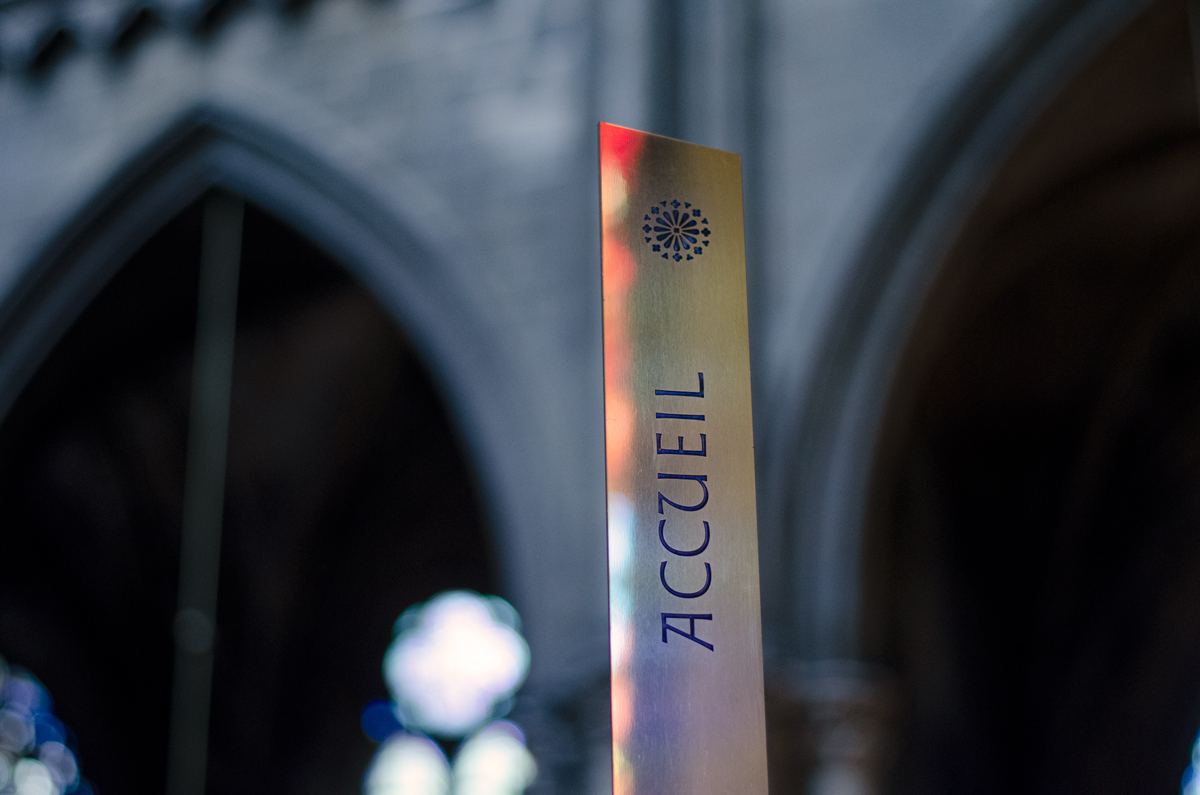


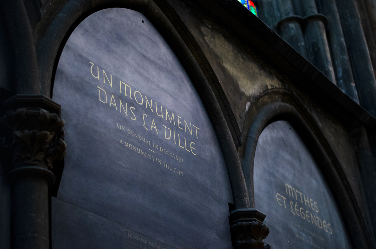

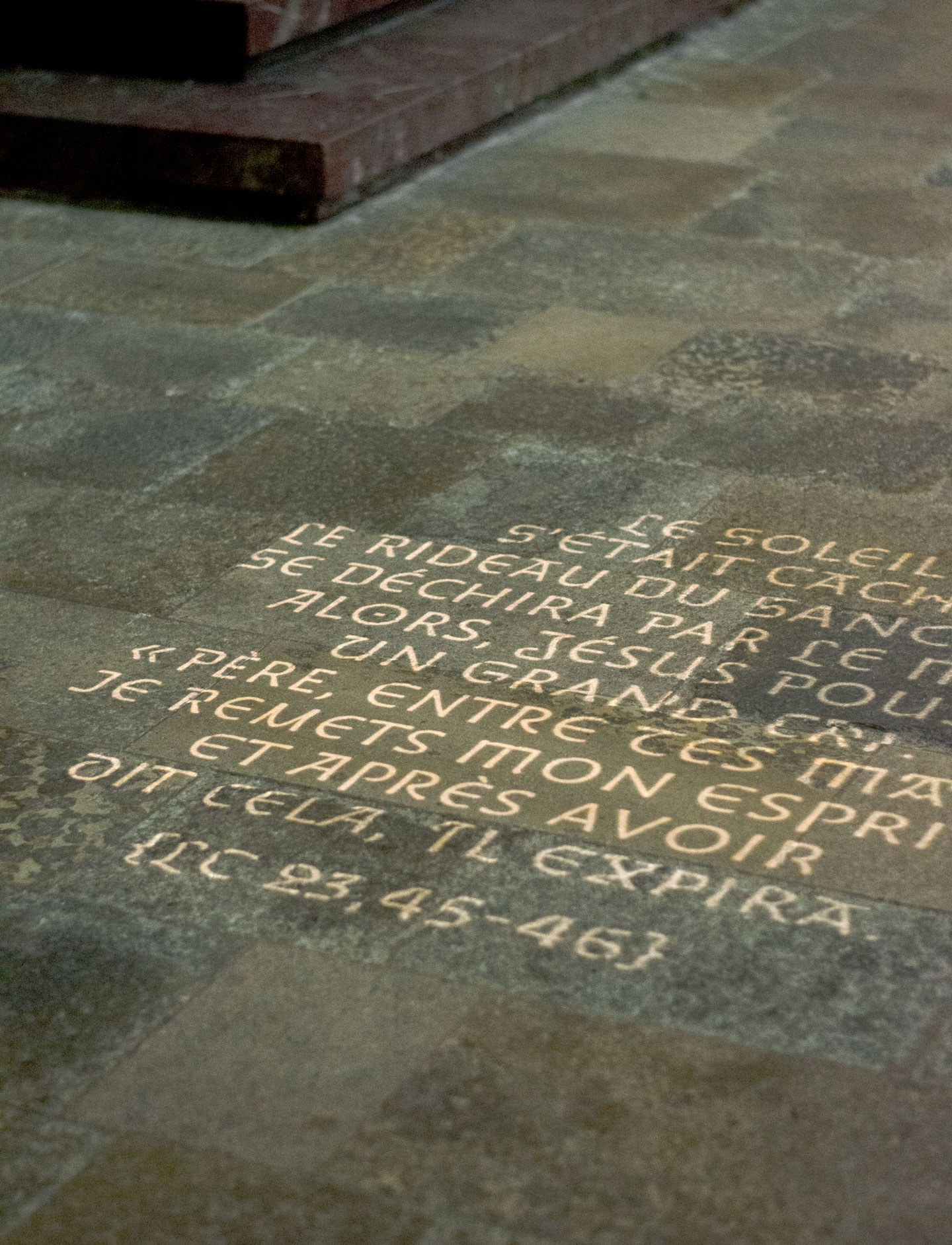
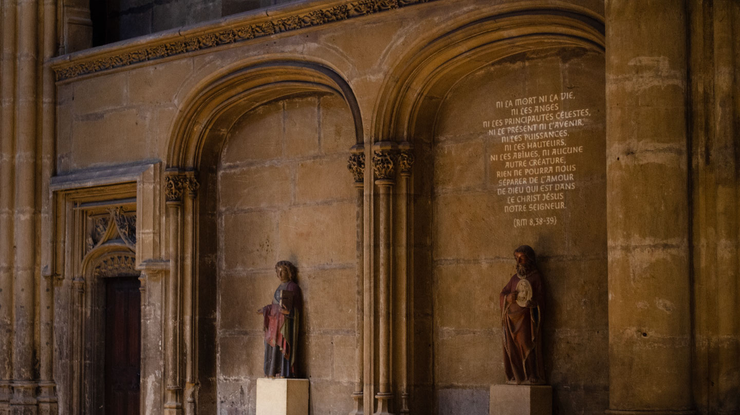
A luminous path "breathes" on the stones and the vaults, according to a planned appearance/disappearance.
Walking in the aisles or the nave, one is sometimes surprised by a text that appears or disappears before one's eyes.
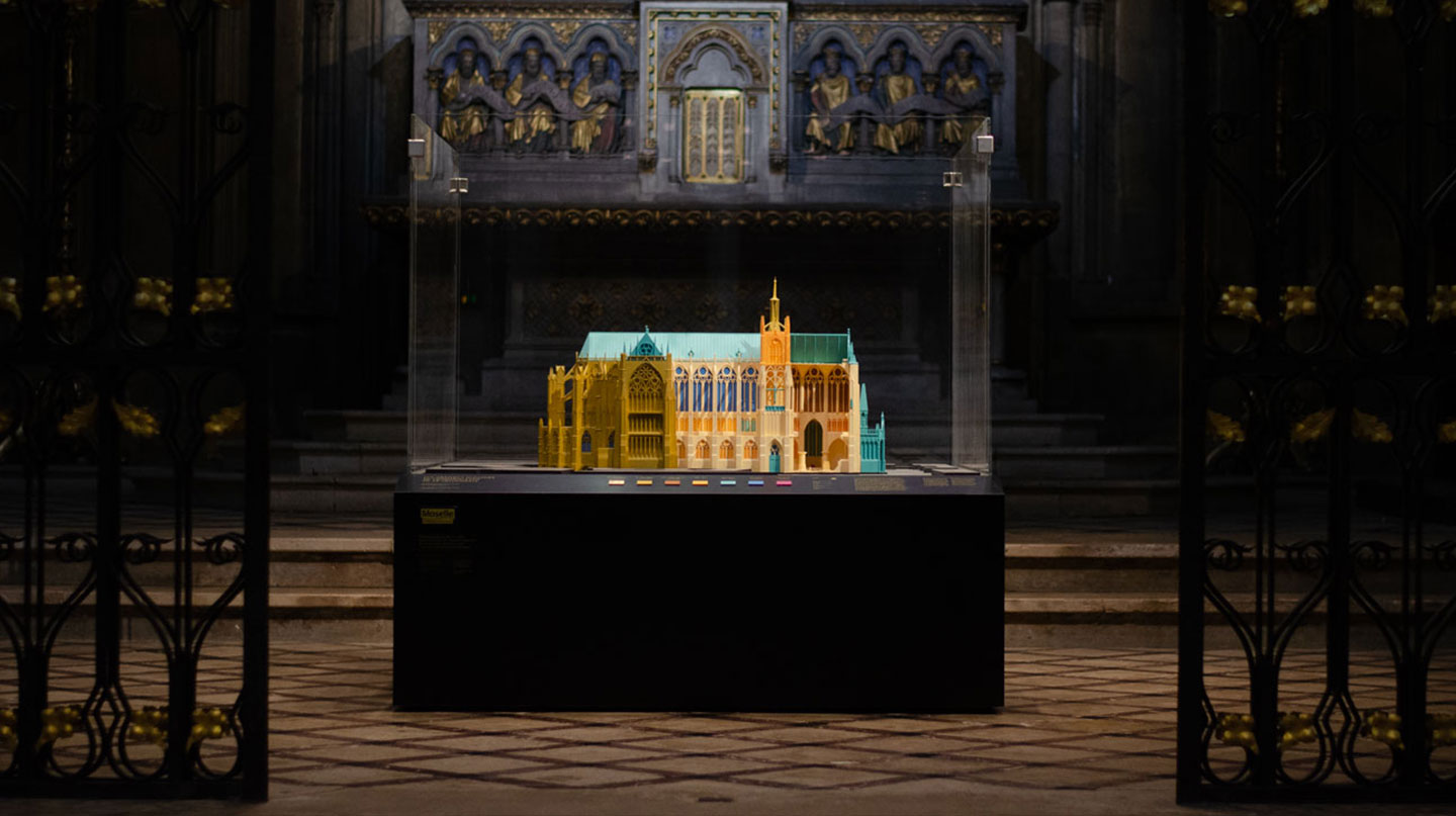
Finally, etched on the metal arches that embrace the stone, a whole patrimonial section offers visitors the opportunity to explore the 800 years of the cathedral of Metz in words, models and archive footage.
